TYPOGRAPHY | RESEARCHIn Restless Aesthetic Pursuit: Recontextualizing Typography
A study of expressive, creative, and nontraditional forms of typography and their application in design using analog and digital methods.
“True experimentation means taking risks.”
–Michael Worthington (Triggs 115)
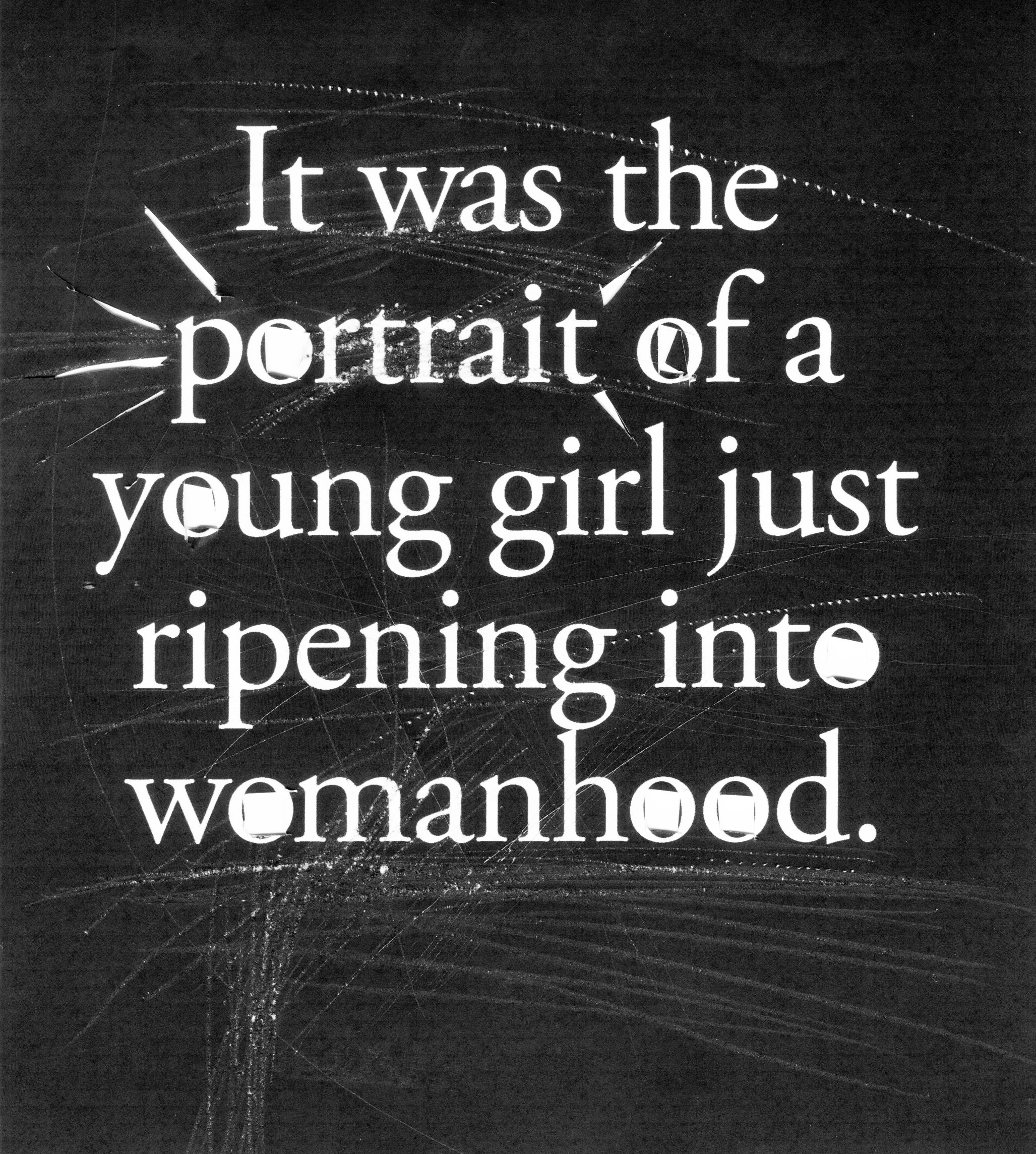
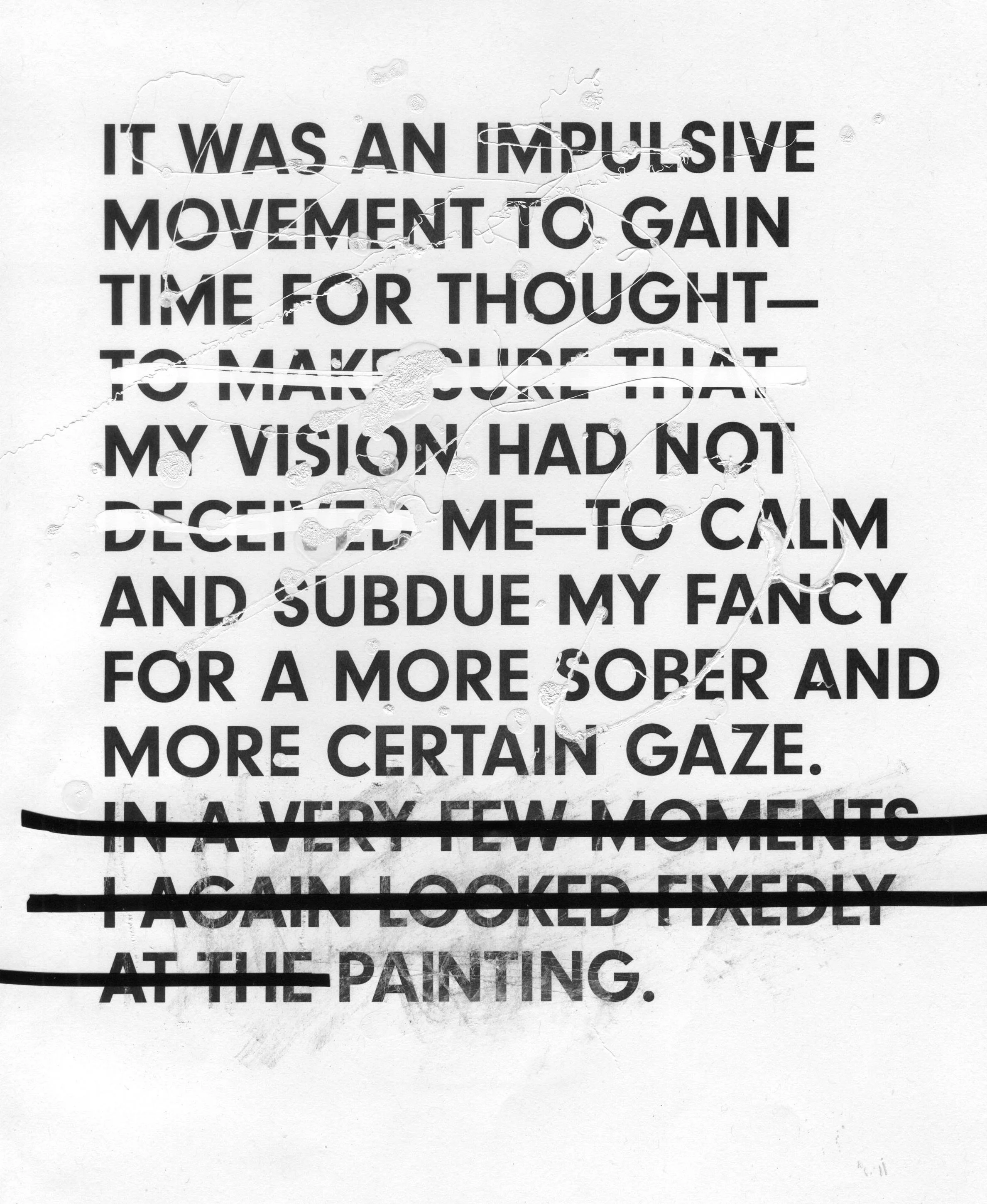
Communication and aesthetic resolution are primary considerations in solving design problems. Good, solid typography skills are critical for students and practicing designers. But once the typographic skills are honed, what’s next? This study looks at how we can inject more creativity, typographic expression, and a sense of play into typography through analog and digital means and how that might manifest creative growth. One of the propelling goals of this project was to find new ways to recontextualize typography—modifying letterforms—through physical slicing, cutting, rearranging, stabbing, and generally altering portions of the text, whether it was taking cues from the written words or by analyzing composition.
The Rules
Typographic rules are essential for professional practice and necessary to meet industry competencies that facilitate communication. Author Steven Heller describes type as “a vessel that holds the codes that represent ideas that convey meanings that trigger understanding,” (Heller, vii). To that end, the typographic principles taught in higher education follow formal concerns of structure and legibility to ensure that clear communication is conveyed. We teach students how to create a typographic hierarchy, how to kern, how to choose an appropriate typeface and point size, and when to indent. A good designer knows when to use an en dash and when to use an em dash, when to use italics, and the difference between quote marks and foot marks. All of those typographic niceties can enhance communication and also make the words on a page look polished and professional. While those rules should be followed in most design situations, there are also times when rules must be broken. In these cases, unconventional typography becomes a means of enhancing communication and a medium of artistic expression unto itself.
Expressive forms of design and typography have gained favor at various points, and a few moments in time that resonate with this project include the visual poems of the Futurist artists in the 1920s and 1930s and Wolfgang Weingart’s typographic experiments in the 1970s. In these cases, normal syntax was abandoned in favor of expression and freedom. The Futurist Filippo Marinetti designed the typography in his poems to personify and enhance the meaning of the words. The poems became visual art comprised of words bouncing around the page with a fierce energy. In a slightly different fashion, Weingart’s trailblazing typographic studies intentionally broke syntax. He famously stated, “The only way to break typographic rules was to know them” (Weingart 77). He had grown a bit bored with following the rules too. His typographic studies weren’t always readable, but his consideration of weight, balance, and texture on the page was beautiful. His visually groundbreaking work provides another inspiration for this study.
László Moholy-Nagy’s typographic interventions also provide inspirational points of departure from a homogenized corporate approach to teaching typography. His New Typography Manifesto published in 1923 declares, “We want to create a new language of typography whose elasticity, variability and freshness of typographic composition is exclusively dictated by the inner law of expression and the optical effect” (Moholy-Nagy). Moholy-Nagy’s emphasis on expression and optical effect shares much in common with my own project. In solving visual problems, graphic designers usually remain objective, seeking to solve the problem strategically through research of competition, demographics, and project goals. It is the rare occasion when a designer is given cart blanche on a project, as there is typically some big idea, goal, or parameter that must be followed, and design solutions have to be justified to clients. While remaining objective in design is necessary most of the time, finding ways to be creative, experiment, play, and pursue freedom of expression in design is also necessary.
The Study
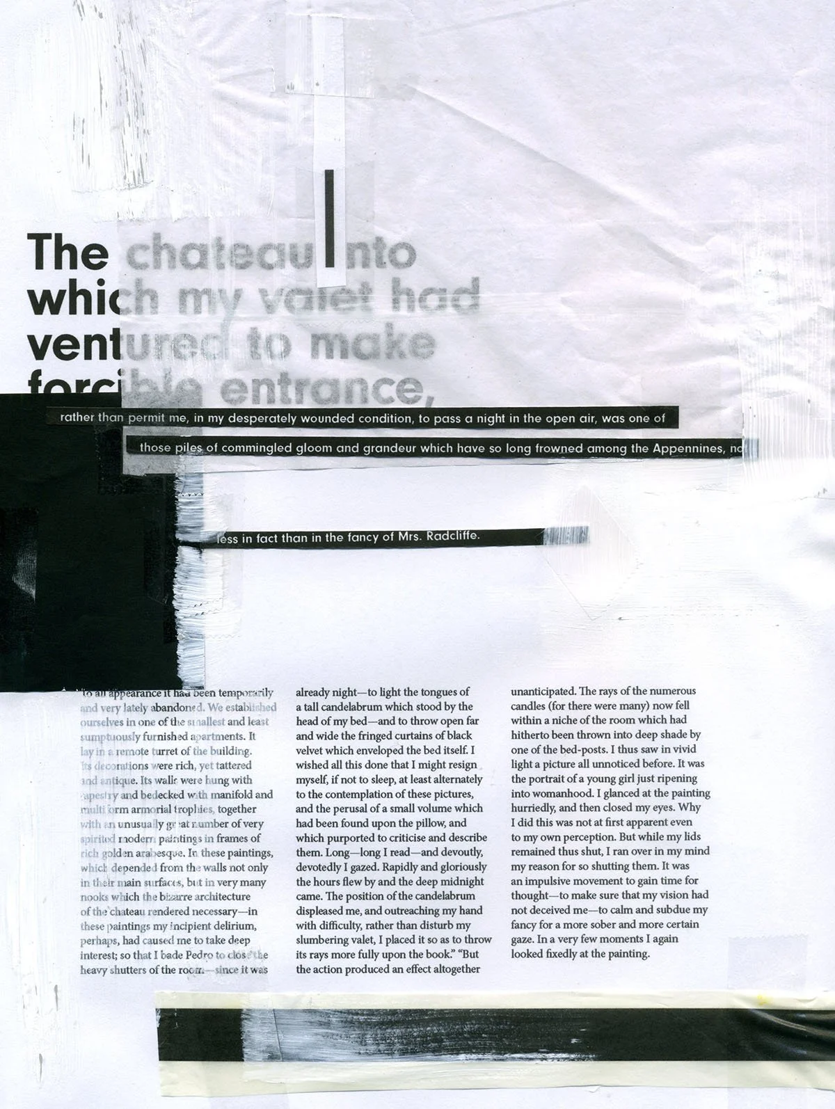
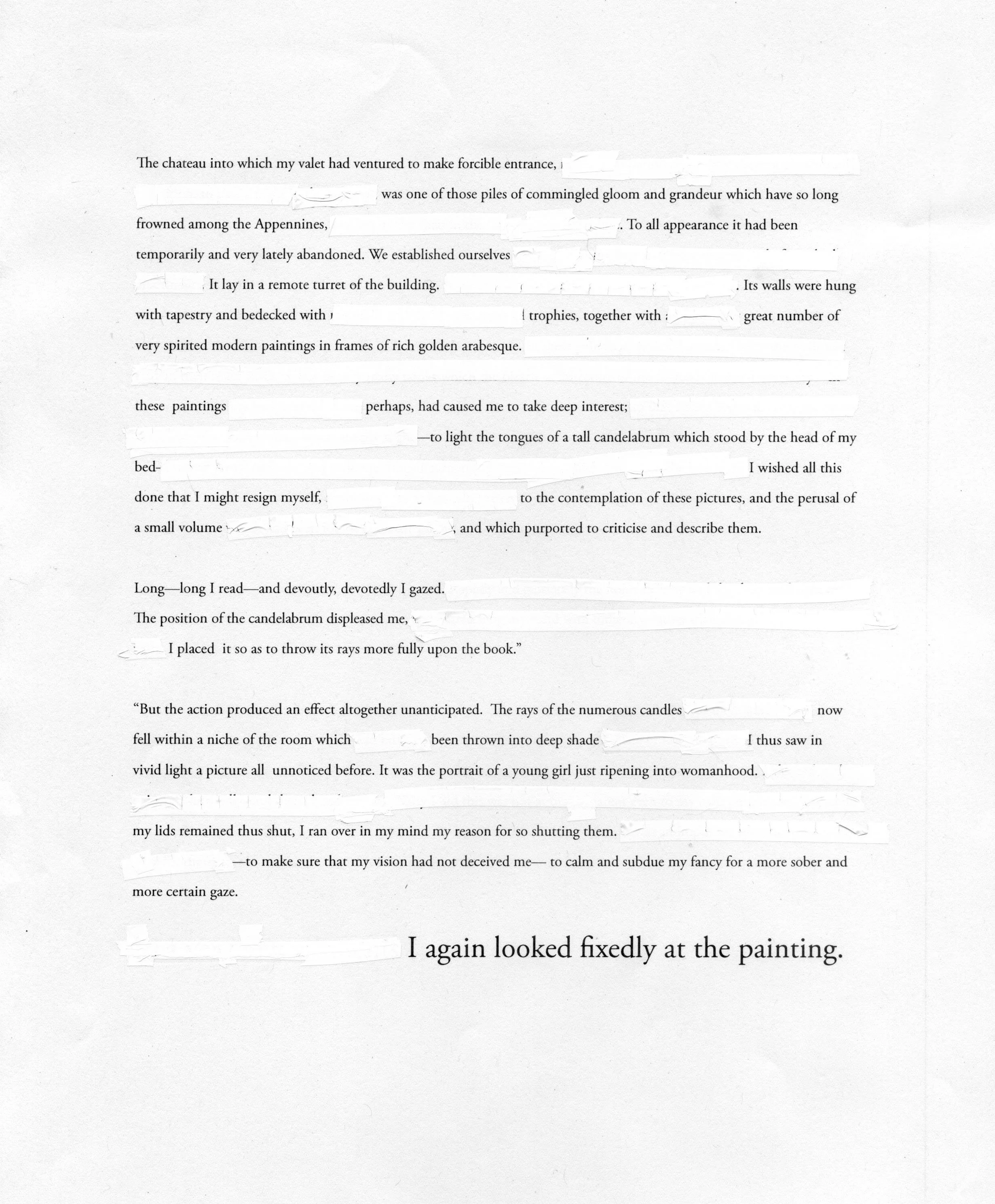
I selected Edgar Allen Poe’s “The Oval Portrait” as the text to work with for this set of experimental type studies primarily because of its short length and Poe’s emotive writing style. My personal affinity towards Poe’s work also factored into the choice as well as the text’s theme, which focuses on the complex relationship between art and addiction—addiction to art and to the perfection of art—ideas that these typography studies actively pursue. The highly descriptive, classically dark, and gloomy gothic text proved useful for redacting text, one method of typographic play. Cutting, slicing, stabbing, scratching, and modifying the words seemed to fit with the narrative drama, although the choice of text was not crucial to the study. A key component was using my hands in the process. That was important. Getting away from the confines of the digital page and tools changed the process and the approach, which changed the design possibilities and the visual outcome.
Self-imposing some parameters was essential for the study in order to create a methodology and for comparison and evolutionary purposes. The few parameters for the project include a 7 x 9-inch page and using the same amount of text on each page, at least in the beginning phase. The typeface choices varied, as it wasn’t about the typeface, but I did stick to traditional choices such as Garamond, Caslon, Franklin Gothic, and Futura. While I aimed to be somewhat free from rules and constraints, it proved impossible to ignore the content. Words beg to be read after all. My early studies involved typesetting passages from the story in Illustrator. The page studies considered hierarchy and flow in traditional arrangements that later segued into attempts at alternative layouts with visual gaps in sentences, irregular leading, word spacing, and unusual text shapes. Using these page layouts as a starting point, I incorporated physical modifications with white-out tape to remove words and a black marker to redact the text. Electrical tape, white acrylic, scotch tape, glue stick, and inkjet prints transfer methods were also part of the process. Even though this is a text by Edgar Allen Poe, the designer—in this case, myself—becomes the editor by alterations in syntax based on design decisions. Designers can impact the reading experience by offering options to traditional linear reading.
After working with paragraphs and longer sentences, the studies shifted to shorter phrases or words to effectively create more obvious typographic changes. Rather than changes to a page, the alterations affected the readability of phrases. For example, at this point in the study, the type experiments shifted to working with shorter words and phrases that were more easily read at a glance. Paper cutting became my go-to technique, as I found it the fastest way to alter the type and the reading experience. Slicing words and hand composition was the most satisfying method in terms of physical manipulations. After the type was cut and composed, I photographed or scanned the transformation and image traced in Illustrator or modified the scan in Photoshop. Additional techniques included crumbling and twisting prints, weaving two prints together, and scratching the surface of the prints with an X-Acto blade to yield new textures and forms.
Pedagogical Application
After completing the typographic studies, I introduced the idea of typographic play to a Typography II class as a vehicle for learning new processes and methodologies that can foster creative growth and yield unexpected results. The topic provided a way to introduce students to the idea of desirable difficulty. Psychologist Robert Bjork coined the idea that more difficult tasks will slow down the learning process but create better retention of the information and craft knowledge for students (Bjork and Bjork). Some of these type experiments are still legible, but some are much more difficult to process—not a quick read, yet perhaps there is intrigue in trying to process the message. The experiments may even create an emotional connection with the viewer. Sometimes what we deem to be good typography is also invisible. We can hypothesize that the viewing experience might be better retained and remembered because of the decrease in readability. The viewer must work a bit harder to decipher the message, but the retention of the message or the image increases.
These experiments with typographic play directly inform my personal craft knowledge, knowledge which British design theorist Peter Dormer describes in the following way, “craft knowledge itself enriches individual experience and becomes a part of the self that is expressed in art or studio craft,” (Dormer 8). Craft knowledge becomes personal as the result of investigation and doing the work.
Avoiding Formulaic Design
Students are always eager to do what will earn them the good grade rather than taking a risk or seeking open-ended discovery without knowing what the final product will look like. Encouraging rule-breaking in design and allowance for productive mistakes is an intimidating concept to students. To facilitate creative discovery, I assigned a project titled “Mapping Your Route,” for which students had to use typography to map directions from points A to B through four steps. Step one was to break down the directions using words, sentences, or numbers in a structured and abstract way. Using lines, textures, and graphic shapes to depict the route occurred in step two. The third step called for typographic manipulations similar to those in my study. Students printed key parts of their directions and sliced, rearranged, folded, crumbled, and shifted the type in ways that wouldn’t naturally happen in design software. Some students attempted to dissolve ink in nail polish remover, soak the paper in water, or splatter the page with black paint. The selected physical manipulations were then scanned and converted to vector. The final step was to merge, combine, and edit the various steps into one composite, with the goal of indicating a route of some sort. The end result was an 18 x 24-inch poster, many of which were visually intriguing and rich in texture and depth. In at least one case the typographic investigations in class were the impetus for a future project. Developing craft knowledge was a direct takeaway from the project for students.
Beyond the Classroom
This methodology is equally applicable to any graphic designer, not solely students, as a way to delve into new techniques and arrive at unexpected design solutions. Often professional designers must adhere to company design guidelines, follow a team-based design approach or are simply working in production mode. And it’s rare that designers are given carte blanche with projects. Additionally, it’s easy to slip into comfortable design habits—choosing favorite typefaces and using tried and true layouts—yet allowing time for experimentation and creative growth can be fruitful.
On a more practical note, I assigned a process-based book project where the use of a grid and adherence to structure to facilitate typographic hierarchy were required—a happy medium between play and structure. Step one required students to choose an appropriate typeface and be sensitive to the reader’s needs. The other requirement was to choose a set of phrases—key portions from the narrative—and physically modify the type either physically or digitally. The goal was to create physical type modifications to enhance storytelling. The end results were books that incorporated type as image and form, as well as type that was informational and easily read. One of the assignment's goals was to get the students thinking typographically—conveying ideas through type but in a more practical, professionally accepted way, as the readability of the text is critical in literature.
The Conclusion
Preparing students to demonstrate professional typographic competencies is a must in design curriculum, but perhaps equally important is providing opportunities for personal growth, design discovery and for giving the green light to explore new ways to express ideas that can enhance visual communication. My hope is that students are open to embracing process and experimentation in future design projects.
Personally, “The Oval Portrait” typographic studies provided me an opportunity to experiment, to initiate play without purpose, and make productive mistakes. Is this methodology applicable for any design problem? Not at all, but it forced me to be thoughtful, to consider creating emotional connections in design, to seek aesthetically pleasing type designs, and to play with and without purpose. It’s what we as designers bring to the table that makes us different. Our unique take, our sensitivity to aesthetics and concepts, our use of process, and our desire to make work that stands out is what makes us valuable. I’ve realized that it’s ok and even necessary to break rules. After all, we have to grow creatively, we have to try new things, and we have to make mistakes. Otherwise, what have we really learned?
References
Triggs, Teal. The Typographic Experiment: Radical Innovation in Contemporary Design”, Thames and Hudson, 2003, p 115.
Bjork, Elizabeth L., and Robert Bjork. “Making Things Hard on Yourself, But in a Good Way: Creating Desirable Difficulties to Enhance Learning.” Psychology and the Real World, edited by M. A. Gernsbacher, R. W. Pew, L. M. Hough, and J. R. Pomerantz, Worth Publishers, 2011, pp. 56–64.
Dormer, Peter. The Art of the Maker: Skill and Its Meaning in Art, Craft and Design, Thames and Hudson, 1994.
Heller, Steven, ed. Education of a Typographer. Allsworth Press, 2004.
Moholy-Nagy, László. “The New Typography.” Staatliches Bauhaus in Weimar, Munich, 1923, designopendata.wordpress.com/portfolio/the-new-typography . Accessed 3 Dec. 2019.
Weingart, Wolfgang. “My Way to Typography.” Graphic Design Theory: Readings from the Field, edited by Helen Armstrong, Princeton Architectural Press, 2009, p. 77.
Left: Creating simple shifts down the page (left) slows the reading process, but the readability is still largely intact.
Above: Analog type experiment—weaving parts of two different typefaces together to make a hybrid form.
While the experiments began with digital typesetting, I quickly moved to analog play. My materials of choice include electrical tape, white acrylic, scotch tape, glue stick, and transfer methods using inkjet prints. The x-acto blade, in particular, was a useful tool.


